Have you ever pondered the number zero? It’s a bit of a strange one (or in fact not ‘one’ at all, but you know what I mean).
And if you really think about it – as I was while staring at the state of my savings account last weekend – it’s actually quite bizarre. Someone created a number to represent the absence of a number.
I was a bit angry, to be honest. Who the hell decided to give value to not having something, and thereby create a way to rub my nose in my own poor decisions?
Sometimes, in my line of work, the notion of zero also manifests itself. Scientific topics can involve dense information that doesn’t easily lend itself to clear communication – which means we have to distil it down to its essence and prune the rest. In other words, we need to embrace a degree of absence.
So, apropos of nothing (pun intended), I decided to explore a hypothesis about zero. A null hypothesis, as it were.
My hypothesis: if the concept of zero is used in a marketing campaign, then the campaign will be successful.
I started by researching some industry-leading campaigns.
And it soon became obvious that adding some ‘zero’ to your communication really works. I dug a little deeper to understand why, and I’ve concluded that it can help achieve three important objectives.
Medical content is often complex, and it can be difficult to follow. And busy clinicians, in particular, don’t have the time or energy for convoluted communication. As it turns out, 80% of people prefer highly technical information to be written in plain English – and the more specialised the person’s knowledge, the greater their preference for brevity.1
As an example of the power of simplification, a team at Zhejiang University recently developed a brilliant project called ‘Identity Builder’. Through inventive design, they translated the scientific data of over 5,500 rare diseases into striking visual identities. They nearly did away with words altogether, and in doing so, achieved clarity.
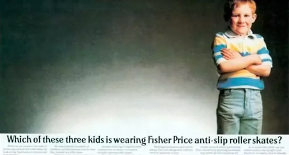
In marketing communications, there can be a temptation to hit people over the head with your message. But sometimes, less is more – if your audience has to ‘join the dots’ to some degree, it helps involve them in the communication. The old Fisher Price ad below is a classic example of this approach, in that its effectiveness hinges on what is not there.

This technique of selectively leaving some things missing is called the Zeigarnik effect. By engaging your audience to fill in the blanks, they are more likely to recall your message.
We recently used a similarly indirect conceptual approach on a global campaign we created for the rare neurological disease neuromyelitis optica spectrum disorder (NMOSD). Take a look and see what you think.
One of the pillars of marketing success is consistent long-term campaigns to build brand recognition. This has recently been highlighted by System1’s enlightening Compound Creativity research.
An oft-cited example of long-term consistency is Patek Philippe’s ‘Generations’ campaign. Whereas some campaign concepts are discarded after a year or two, this one has been running since 1996! Of course there have been creative iterations over the years, but there’s been zero change to the overarching concept or indeed the (brilliant) copy. It is, fittingly or perhaps ironically, timeless.

So as much as the concept of zero currently pains me in a personal sense, it can work wonders for creative campaigns – and arguably the more complex the topic, the better it works.
There is clearly a strong case for adding some zero to your marketing communications, if done the right way. So give us a call to see how we can help – you’ve got nothing to lose.
References