Web accessibility: it’s a term that has been bandied about the corridors of web design for over 22 years.1 According to Wikipedia:
“Web accessibility is the inclusive practice of ensuring there are no barriers that prevent interaction with, or access to, websites on the World Wide Web by people with physical disabilities, situational disabilities, and socio-economic restrictions on bandwidth and speed”2
As the internet rapidly becomes the de-facto way most people communicate and do business, web accessibility is more critical and timely than ever.
It is especially important for healthcare businesses: along with the health condition your product or service targets, some of your potential customers will also have a disability, be elderly, or require an accessible interface for another reason. Maximising accessibility ensures all potential customers can interact with your website and learn about what your business offers.
Yet, accessibility is often considered an optional extra that’s ‘nice to do if we have the time and budget’. It also has the stigma of being an arcane art.
While it’s true that the accessibility landscape is constantly shifting, with an influx of new devices and the introduction of interfaces such as augmented reality (AR) or virtual reality (VR) and other wearables, the basic principles remain the same. Although there is no ‘magic button’ to make your website accessible, accessibility can easily be achieved with some effort and forethought.
In this article, I propose that web accessibility:
The World Wide Web Consortium (W3C) established the first Web Content Accessibility Guidelines (WCAG) in 1999 and released a more comprehensive 2.0 version in 2008 that we still refer to. These guidelines put forward three levels of compliance:
Without going into the nuances, each level covers the same areas of accessibility but with increasingly stringent criteria. These days, government and educational sites are required to meet AAA standards; the rest of us strive for AAA while at least meeting AA.
Google’s Web Fundamentals classifies accessibility issues into three main categories: situational (e.g. holding a phone or baby), temporary (e.g. broken arm) and permanent (e.g. loss of limb).
While the benchmark aims to meet the needs of people with permanent, certifiable visual, auditory, speech, physical or cognitive disabilities, achieving these standards helps a surprisingly large number of other visitors. The elderly are the most notable group to benefit. However, meeting accessibility standards is also an advantage to those using limited-capability devices, or using keyboard only or voice only, and so on.
Web accessibility issues can be a total dead-end for some visitors, but for the rest of us, they can still be highly inconvenient or annoying – enough so that some potential customers will lose patience and leave your website.
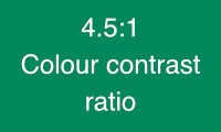
For example, have you ever found yourself squinting to try to make out some text on a webpage? Maybe there was sunlight on your screen or your eyes were tired that day, or maybe it was just too far off the acceptable colour contrast ratio of 4.5:1.
‘Ratio – what?’ you might be thinking. You don’t have to be a math wiz to understand it: a colour contrast ratio is basically a comparison between the brightness (luminance) of the foreground versus the background colours. The 4.5:1 ratio is considered the AA standard because it is appropriate for the elderly, for people with low visual acuity and for those with colour deficiencies.
Take a look at the following examples and find the point where your ability to quickly and easily read the text starts to fail.


Everybody’s eyes will see this differently at different times of the day and subject to many other environmental factors. That’s even if you aren’t one of the 1 in 12 men or 1 in 200 women worldwide with colour blindness3.
Another example: You are about to click on a hyperlink, but instead of telling you where it’s going to take you, the text just says, ‘click here’. You’re not in the habit of clicking suspicious links, so you decide not to go ahead.
Or, you’re trying to tab through a form with your keyboard. It stops at one of the fields and refuses to proceed, or it jumps around out of order, and you give up on filling out the form altogether.
Lastly, perhaps you’re reading an article and you’re trying to remember what the section topic is. You scroll back, but there’s no semantically structured level of Headings (see below), so you can’t find the relevant subheading.
You get frustrated and decide to bounce to the next search result.
As you can see, accessibility helps all users engage with your website.
Put your hand up if you’ve ever heard (or even found yourself saying) something along these lines:
“We’ve got a tight budget so we’ll do what we can with accessibility or circle back to it after launch.”
“Accessibility isn’t a major concern for our target demographic.”
“We’ll address it when/if it comes up in user feedback.”
The key to avoiding all of these (often guilt-laden) statements is simple: asking accessibility-informed questions throughout the web design process.
When accessibility informs content and design decisions from the outset, there’s very little added cost to the process. Considering accessibility doesn’t necessarily make these decisions more difficult, either.
Of course, there will be some extra work involved, such as writing alternative text (alt text) for all of your images and writing subtitles and captions for your videos. However, it’s better for this work to be considered up front, rather than trying to squeeze it in at the end. The costs be can considerably greater if a redesign is needed.
Hopefully, it’s clear at this point that improving accessibility helps not only the marginalised but every visitor to your website. There’s one key web visitor we haven’t covered yet, though – search engine crawlers. But what do search engines and their rankings have to do with accessibility?
In June 2021, Google announced it would be switching site rankings away from raw mechanics and stats to include what they call Core Web Vitals. The focus of these is squarely on the user experience. In other words, search engines love accessible sites too.
All of the accessibility issues mentioned here, and more, are considered ‘site errors’ when the analytics tools are run over them. When left unfixed, they will likely factor into future ranking scores.
More and more, search engine ranking algorithms get closer to evaluating websites as a human would. If a website lacks semantic structure, is missing alt text on images, or fails AA colour contrast standards – down the search rankings they could go.
In a more subjective way, building accessibility factors into the web process often leads to better content all round, which leads to loyal repeat visitors to a website, better brand reputation, and eventually increased visibility and rankings. The wins just keep compounding.
It’s never too late to revisit an existing website. Search engines continuously re-crawl and re-evaluate sites, and definitely notice when content has been updated.
However, accessibility comes easiest when it’s woven in at the very early stages of a project. When a team is brainstorming and throwing ideas at a wall, they would naturally consider who the target audience is, but they should also factor in the reverse – who is potentially being left out?
The next phases of wire-framing, creating a design language and a user interface are crucial. Important questions to consider include:
As the web is largely made up of links, clicks, swipes and forms, if you’re considering another interaction, such as accordions, sliders, toggles, tabs or boutique interactions like mouse or eye-tracking, it’s also worth asking who would be left out and what alternative would need to be built as a fallback.
With Wellmark as your guide, you can leave the mechanical implementation of meeting accessibility requirements to us. However, it’s good to be aware of some of the basic needs when they come up in early planning discussions with our team.
There are exceptions to the 4.5:1 colour contrast ratio target such as large display text and logos – so your existing brand might be safe. However, adapting your colour palette to the web might require some slight tweaking so that all your content is readable.
This is another common issue packed with possibilities (and potential pitfalls).
Visual media hits the mark when it accentuates your content without being relied on to convey it. Complex diagrams are particular gnarly – they often include a lot of important information that either needs to be typed out in the alt text or fully covered in the image caption or body text.
Writing text that displays when an image is turned off by choice, or when a screen reader is looking to read a replacement for the image, is an art unto itself.
Close your eyes and picture ‘image-42’. What do you see? Nothing?
Okay, now close your eyes and picture ‘a photo of two dogs’.
If you’re lucky enough to have seen dogs, I’m sure one of your favourite memories immediately comes to mind. But is it this one?

The alt text needs to describe the appearance and functional characteristics of an image, within the context of the subject matter. So if it didn’t say something like the following, the non-viewer would miss so much information:
“Two small dogs sleeping on a couch, one laying on its back with legs splayed and crushing the other dog’s head.”
Imagine tabbing through the links of a web page extracted from the content (screen readers do this for the visually impaired). There’s no context provided if it reads:
here
here
click here
website
Your website might actually pass AA standards but definitely not AAA or even general usability.
There’s nothing technically wrong with spelling out the website address, so you could also go back to:
yourgreatsite.org.au
However, this approach is generally discouraged, as a screen reader will read every letter out one at a time like:
y-o-u-r-g-r-e-a-t-s-i-t-e-dot-o-r-g-dot-a-u
The best approach is always to link URLs contextually, such as:
You will find a lot of fine articles on our Wellmark blog.
There are many more nuances but those are the heavy hitters and the elements you may be involved in from a content perspective.
We have taken a brief look at some of the intricacies of web accessibility. While these factors are important on their own, it’s worth noting that they sit within the larger framework of Accessible design. This practice extends across product design (of the devices you would be reading this on, for instance), engineering and manufacturing.
More recently, Accessible Design is itself seen as a subset of [Inclusive Design]4. This is a much larger topic that always informs our planning discussions with clients to ensure the target demographic is being well-represented along with respectful considerations of age, gender, race, and physical and mental diversity.
You may sometimes think or hear things like, “We barely considered web accessibility on a previous project, what’s the worst that could happen?”, or “I thought the web folks just took care of this stuff?”
While an experienced design team will catch most of the nitty-gritty details, I hope I’ve demonstrated that accessibility more often influences major design and content decisions from the ground up. The larger problem (and cost) unfolds when accessibility becomes an afterthought and major work has to be redesigned.
The good thing about the web (and digital, in general) is that changing something after the fact might only require some new decisions and a few additional hours of work. We’re here to guide you on this journey should you need to revisit existing projects. It’s not so easy for other industries – for example, see these tragic oversights on the design of a $42 million library that left large sections inaccessible to children and people with physical disabilities.
I hope this article has given you some fresh insights and that you feel more confident about what web accessibility means and how important it is to your visitors and your business.
We’ve had our head in this game for years, so don’t hesitate to reach out. Whether you want to revisit and improve your existing site or start planning a new website project that’s as inclusive as it can be to all of your potential customers, we can help.
 Jason Shanks,
Digital Director | Senior Developer at Wellmark.
Connect with me on LinkedIn
Jason Shanks,
Digital Director | Senior Developer at Wellmark.
Connect with me on LinkedIn