With the pandemic bringing so many things in life to a halt, I suddenly find myself much more aware of motion. Spending time at home rather than rushing from place to place has created space for more stillness, thinking and observation. Against this backdrop, even small movements have become increasingly prominent in my psyche – the swaying of leaves in the wind, the way my fingers move on the keyboard as I type this, or the slow lengthening of shadows on the wall as the Earth rotates.
I recently participated in an animation bootcamp, a refresher class on digital techniques and the fundamental principles of motion and animation. This, along with my increased awareness of everyday movement, has got me thinking about the basic physics behind motion and how it can be applied in the digital sphere.
Consider this example: if someone was walking down the street without swinging their arms, they would look robotic and strange. This is because we expect objects in the real world to follow the natural laws of motion. The same is true for the digital world. When animations appear to adhere to basic physics, they seem more lifelike.
In 1981, Disney animators, Ollie Johnson and Frank Thomas, released a book called ‘The Illusion of Life’. Widely considered the animation ‘Bible’, this book introduced 12 basic principles that can make animated characters appear real. However, applying these principles to even the simplest of movements, such as a button on a website, can improve a user’s experience.
Of the 12 principles, the following 8 can be used widely across all types of digital media and marketing to create the illusion of life. By bringing realism to motion and animation, these principles help potential customers to more comfortably navigate your content, encouraging them to continue to engage with your brand.
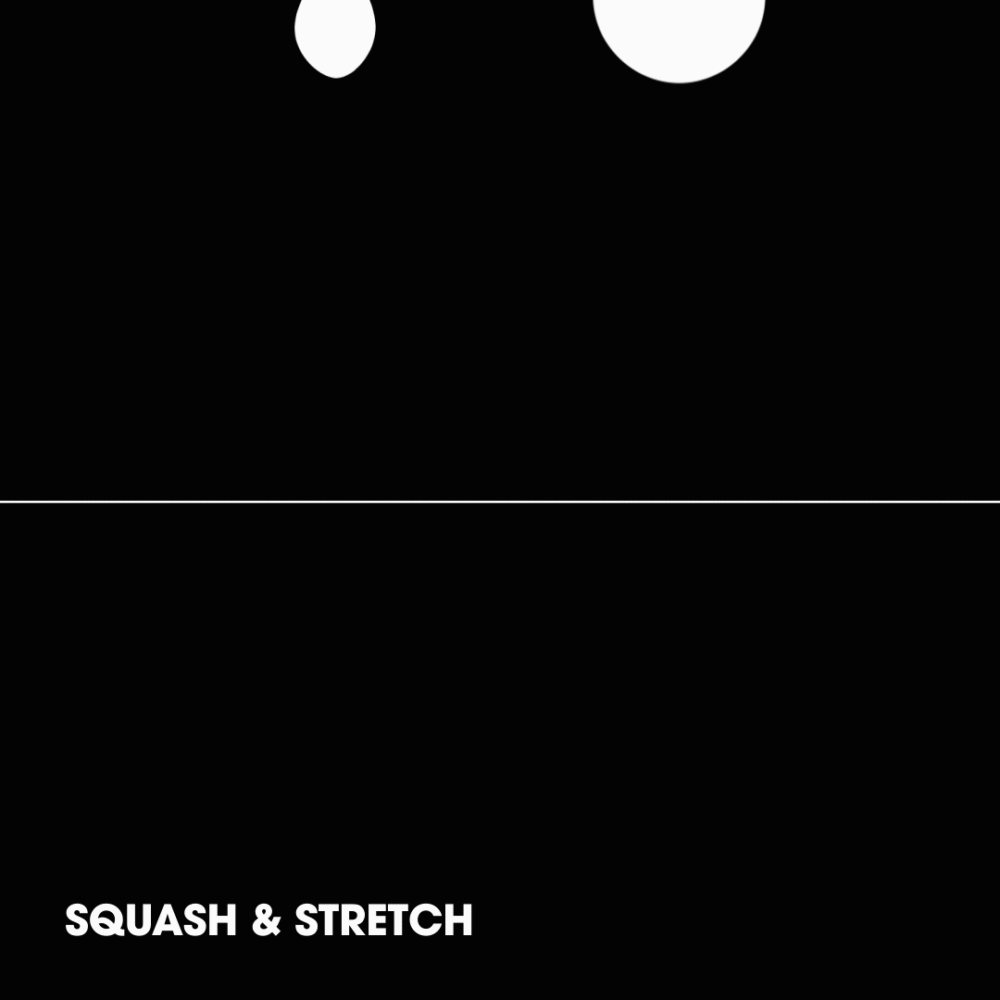
shows an object’s mass, weight, flexibility and gravity. For example, an animated bouncing ball should stretch to some degree when it hits the ground. A bowling ball, however, would have less squash and stretch than a beach ball, as it is less flexible. To give another example, if a button on a website displays squash when pressed, it will seem more realistic. The ‘Merry Christmas’ text in this animated social post that we created for Vision Eye Institute demonstrates squash and stretch as it hits the ‘ground’.
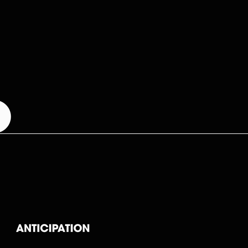
helps users understand what is going to happen next, contributing to ease of navigation in user interface (UI) and digital design. For example, showing a fraction of the next element on a scroll bar helps make the user aware that there is more to come. In complex character development, animating the movement that occurs before an action can create anticipation; for example, a character taking their leg back before kicking a ball. The logo reveal at the end of this animation we created for Newlife IVF is an example of anticipation in action.
relates to the speed of a movement and is important across all motion, animation and video. Its purpose is to hold the user’s attention by not going too fast or making them wait too long. For example, pop-up screens that appear too slowly can frustrate the user and cause them to click away before they complete the target action. In more advanced animation where there is a narrative, timing can be adjusted to help build suspense or agitation. On the Vision Eye Institute home page, we designed the main scrolling panel to transition between slides quickly enough to keep the user interested, while also giving them enough time to read each slide.

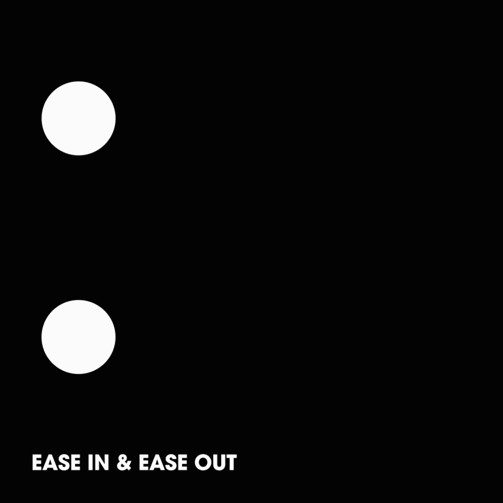
corresponds to the momentum of an object. In UI and digital motion, easing can give a natural flow to the movement of an object. Consider an animation of an accelerating car. If the car eases into motion by starting slowly and gradually increasing in speed, it will appear more realistic. Similarly, a pop-up screen that eases into view may seem more natural than one that appears suddenly. Clicking on ‘Have a question?’ at the bottom of the Vision Eye Institute website causes a hidden question form to expand slowly at first before snapping into place.
refers to where elements are placed in a scene (or on a screen or webpage). In UI and digital design, staging directs the user’s attention to the most important elements. It also helps them understand how the objects in the scene relate to each other. Staging is one of the first steps to consider in UI and digital design. It can begin in the wireframe/storyboarding stage and develops over the course of the project’s life. An example is a loading screen that shows the outlines of all the objects that will appear on the screen once the page has loaded.

help to make primary actions stand out. Many web interactions use this principle to entice the user to spend more time on a page or take an action by adding dynamic flair and interest. This could be as simple as a subtle light running around the edge of the call to action or a little spark that sets off a logo reveal. In the navigation bar at the top of the Newlife IVF website, we created a subtle ‘heart throb’ animation to entice the user to click on ‘COVID-19 advice’.
of certain elements can be used to gain the user’s attention. In digital design, this may include bold, bright colours and loud headlines. Exaggeration can be used to great effect in floating action buttons, chat bots, call to actions and logo reveals. The amount of exaggeration that is appropriate can vary dramatically depending on the target audience. For example, an ad for a discount pharmacy is likely to use much more exaggeration than a funeral parlour. On Dr Amber Kennedy’s website, we added a ‘phone ringing’ animation the phone number at the top of the page, which triggers when the user interacts with the number.
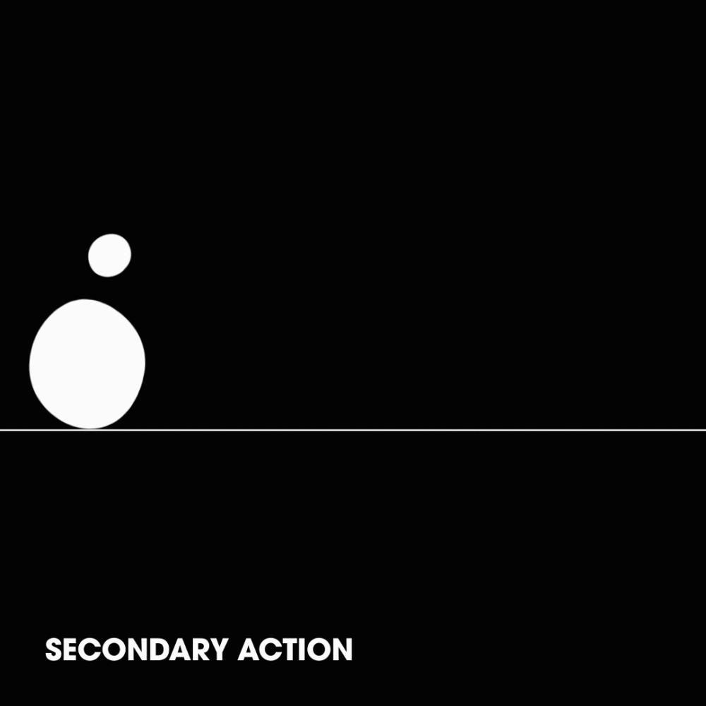
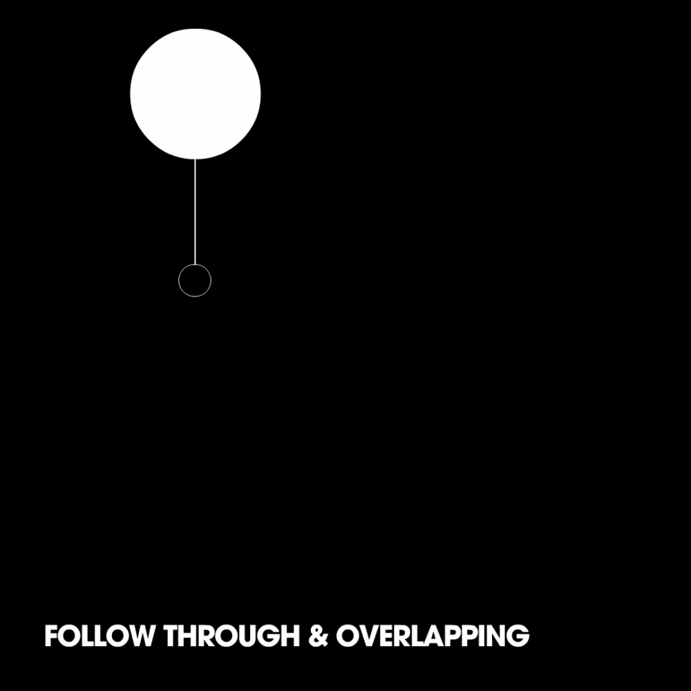
are closely related principles that help animations appear to comply to the basic laws of physics. Follow-through refers to how some parts of an object are still in motion after the object has stopped. Overlapping pertains to different parts of the object moving at different rates (for example, water in a glass bottle will keep moving after the bottle has slammed to a stop on a table). This principle can also be applied to simple digital design and UI. When a user scrolls through a series of tiles with captions below, for example, the movement may seem more realistic if the tiles and captions begin moving at slightly different rates (overlapping).
In UI and digital design, a little bit of realistic motion can be beneficial for a user’s decision-making, navigation and spatial awareness. This can go a long way to encourage a potential customer to take the action you desire, such as booking an appointment, clicking through, or making a purchase. A natural, calm and lifelike user experience could be the difference between a user converting to a customer or disengaging with your brand.
Now that we all have a bit of time on our hands, you may find it helpful to pay attention to movement in your everyday life and consider how it could transpose into the digital world. Digital does not always equal rigid and robotic, but can be engaging, natural and true to life. Or, at least, it can create the illusion of life.
 Ali Edmonds,
Designer at Wellmark.
Connect with me on LinkedIn
Ali Edmonds,
Designer at Wellmark.
Connect with me on LinkedIn